Marketing agency Białystok

Marketing without beating around the bush. We focus on results.

Websites, SEO, ads and branding for companies in Białystok and across Poland. We measure every click. We report every month. We show you what works, and what no longer does.

Get a quote See who we are


Illustrated portrait of Patryk Malinowski, founder of DigiDraft, holding a tablet.

DigiDraft in numbers

The full range of marketing services

Websites, online stores, SEO, branding, advertising and content: six areas, one team from Białystok. Every service has a process, a measurable goal and a price range on our pricing page. No “it depends.”

Websites & stores

Websites, online stores and custom software. We pick the stack (Astro, WordPress, custom CMS) to fit the goal and send you a conversion report after 3 months.

View services

SEO

Local and nationwide SEO. A 50-point audit, a 90-day plan and a rankings report every month, so you see exactly what you pay for.

View services

Branding

Logos, visual identity and materials no one will confuse with your competitors. From first sketch to finished brand book in 2-4 weeks.

View services

Content marketing

Social media, blog, newsletter and video. Content people watch to the end, made to sell. Reach is a side effect.

View services

Advertising

Google Ads, Meta Ads and video campaigns. A brief, a budget forecast, optimization every 14 days. The campaign goal goes into the contract.

View services

Full-service marketing

All your marketing in one pair of hands: one account manager, one plan, one invoice. Packages from PLN 1,900 a month.

View packages

Selected projects.

Projects from different industries: websites, online stores, campaigns and branding. See what “from design to results” looks like in practice.

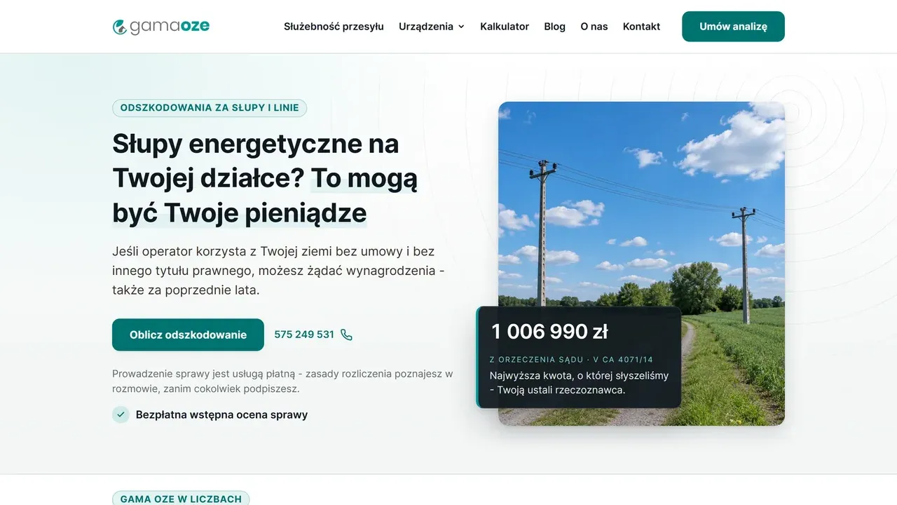
Home page of wynagrodzeniezaslupy.pl, a lead generation website with a compensation calculator for power poles on private land Featured · CRM systems and apps

Lead generation website and CRM - wynagrodzeniezaslupy.pl

We started with a brief and the needs of landowners. That gave us a website with 26 keyword-targeted subpages, a four-question calculator and a short contact form.

The answers and the calculator result land in a single lead card, together with contact history and the assigned sales rep. The CRM sorts inquiries into a pipeline of nine statuses, protects access with 2FA login and exports data to Excel. See each stage of the project on the app screens.

WebsiteCalculatorCRM // result: Website, calculator and CRM in one system See how the project was built
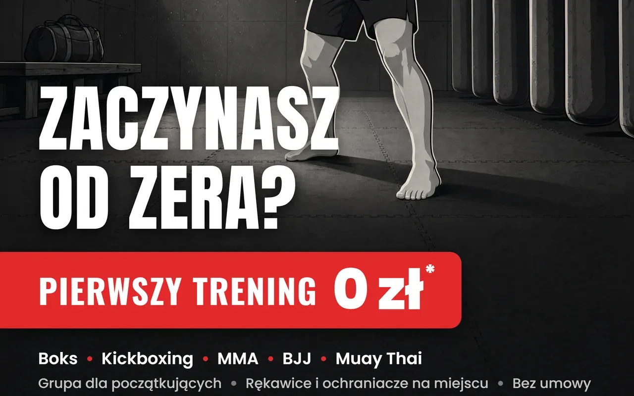
A4 poster for Berserkers Team Rzeszów: the headline “Zaczynasz od zera?” (“Starting from zero?”) above a red bar reading “Pierwszy trening 0 zł” (“First session PLN 0”) Graphic design

A4 print poster - Berserkers Team Rzeszów

A poster for September sign-ups: one hook aimed at a beginner’s fear, an illustration in the club’s style and a CMYK file with bleed, ready for the print shop.

// result: concept, illustration and print PDF with 3 mm bleed See how the project was built
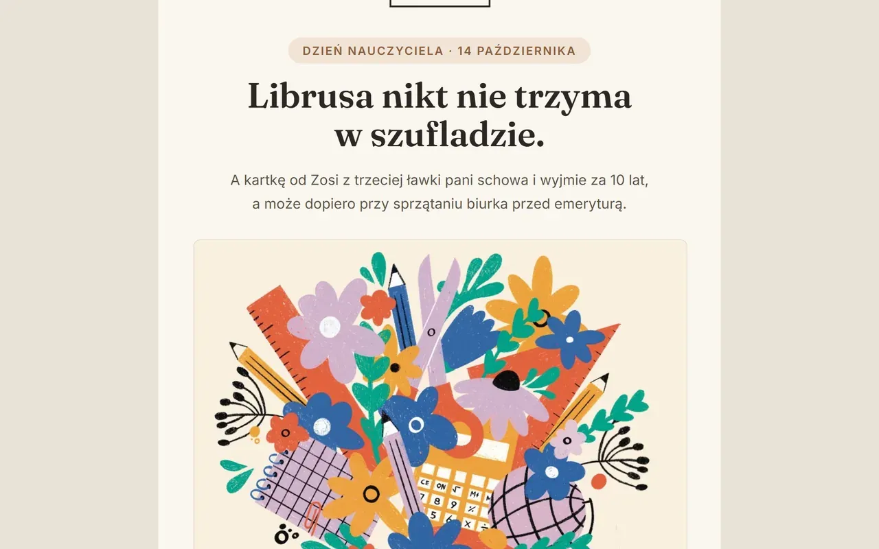
PIESKOT Teachers’ Day email: the brand logo between the taglines “kartki z duszą” and “trafiają do serca”, the headline “Librusa nikt nie trzyma w szufladzie.” (“Nobody keeps the school e-gradebook in a drawer.”) and the “Bukiet Wiedzy” (“Bouquet of Knowledge”) card with flowers, pencils and a ruler. Content marketing

Greeting card brand newsletter - PIESKOT

A newsletter written together with the brand’s owner, starring cards by Polish illustrators. Seven emails in MailerLite from June to August 2026.

// result: 7 sends, 15 card designs by Polish illustrators See how the project was built
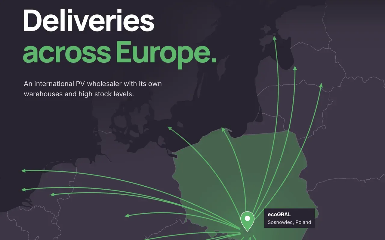
Cover of the ecoGRAL A4 leaflet: the headline “Deliveries across Europe.” above a dark map of Europe with Poland in green, a pin in Sosnowiec and green delivery arrows Graphic design

A4 print leaflet - ecoGRAL

A two-sided English leaflet for a PV wholesaler from Sosnowiec: a delivery map of Europe, five product groups, a band of thirteen brands and CMYK files ready for the print shop.

// result: two pages, 16 delivery directions, 13 brands and a CMYK PDF with 3 mm bleed See how the project was built
Website - Juwenalia Białystok 2025 Websites and online stores

Website - Juwenalia Białystok 2025

A modern website for the largest student event in northeastern Poland: clear, with a strong call to action for ticket sales.

// result: website live before ticket sales opened View project
BKFS logo - a table football club from Białystok, after the redesign Graphic design

Logo redesign - BKFS Piłkarzyki Białystok

A full logo redesign for a table football club: a crest with a player on the rod and a ribbon with the club name.

// result: full file set: SVG, PNG, PDF - full and transparent versions View project
Visual identity design for the 420 Perspektyw podcast Graphic design

Podcast branding - 420 Perspektyw

A minimalist visual identity that pairs clean design with a strong message.

// result: complete identity: logo, cover art, social media templates View project
Meta Ads ad design - Alucover Ad campaigns

Meta Ads ad design - Alucover

A Meta Ads campaign that shows how well Alucover spray protects dogs.

// result: creatives ready for A/B campaign tests View project
Landing page design - Dark Soul Bullys Graphic design

Landing page for an American Bully XL kennel

A striking landing page that shows the strength and elegance of the breed.

// result: landing page + form for puppy inquiries View project
Social media post design - SunGrant Content marketing

Social media post for a renewable energy company

A promotional post built around the quality of the company’s solar panels.

// result: consistent post template for a renewable energy campaign View project
Business card design for SunGrant Graphic design

Business card design - SunGrant

A modern, clean business card that reflects the brand’s environmental mission.

// result: business card consistent with the brand identity View project
Resume design for Malinowski Designs Graphic design

Resume design for a web developer

A modern resume with a clear structure and a creative layout.

// result: resume ready for tech job applications View project
Alucover ad - “Wataha ma coś dla Ciebie” (“The pack has something for you”) Ad campaigns

Campaign - Alucover “Wataha ma coś dla Ciebie”

A short spot with a strong cinematic touch and a dark mood.

// result: cinematic creative for an awareness campaign View project
Meta Ads ad for the Studio Urody Wianek beauty salon Ad campaigns

Meta Ads ad - Studio Urody Wianek

A campaign that mixes a Halloween mood with promotion of the salon’s services.

// result: themed campaign for an in-salon event View project
Meta Ads ad set - Berserkers Team Rzeszów Ad campaigns

Meta Ads ad set - Berserkers Team

A full set of ads promoting events and new training groups.

// result: creative set for different training groups View project
Martial arts club website - btrzeszow.pl Websites and online stores

Martial arts club website

A dynamic website for a martial arts club that gets people to sign up for training.

// result: website + sign-up form for a free session View project
Cover of the Totalna Chemia book Graphic design

Book cover design - Totalna Chemia

An eye-catching cover for a chemistry prep book for the Polish matura exam.

// result: cover consistent with the Totalna Matura series View project

Every project starts with a specific goal.

We don’t show projects just for the pictures. Behind each one is a company with a problem and a result that could be measured. Before we design anything, we ask what should change in your business.

We work the same way on websites, SEO, ads and branding, because the goal never changes: a real result. A nice-looking file on its own doesn’t count. Browse the full portfolio or check right away what your project will cost.

Behind the project

GAMA OZE wynagrodzeniezaslupy.pl

From brief to a website
that supports the business.

GAMA OZE came to us with a specific problem and filled out a brief. From the needs of the company and its audience, we moved on to a website, a calculator and a CRM dashboard.

  • Website
  • Calculator
  • CRM dashboard

The problem and market needs

We started with the brief and a specific problem.

GAMA OZE came to us because it needed to reach landowners with power poles on their plots and to organize how their inquiries were handled. The company filled out a brief, and that opened our conversation about the project goal, the audience and how the team works.

Design decision Meet the needs of both sides: the landowner wants to understand their situation and options, and the GAMA OZE team needs information that lets them lead the conversation. That set the scope of the website, the calculator and the CRM.

From brief to design

We turned the audience’s needs into a website.

From there, we laid out the content and the path to contact. The website had to answer the landowner’s questions: what the service covers, where to start and who to talk to. That’s why the first screen explains the topic, shows the phone number and leads into the calculator.

GAMA OZE home page with a headline about power poles on a plot, a calculator button and a visible phone number.
Home page: the topic, the action and the contact in one view.

Design decision Every screen helps with the next step: understand the topic, check your situation, talk to someone.

From question to inquiry

The calculator gives the conversation a starting point.

Next, we designed four questions about the situation on the plot. The result shows an approximate range. Users can check it without signing up or giving a phone number, and only then decide whether to get in touch.

Calculator form: the question “Co stoi na Twojej działce?” (“What stands on your plot?”), tiles for choosing the equipment and an answer counter showing 0 of 4.
First calculator step: choosing the equipment on the plot and the answer counter.

Design decision The answers and the result go to the CRM together with the inquiry. The sales rep sees the same context as the client.

The team’s back office

Every inquiry gets a follow-up.

Alongside the website, we built a workspace for the team. The lead card collects contact details, the calculator result, status, assignment and contact history. The team can go from inquiry to contract without losing track of what was agreed along the way.

CRM lead card with blurred contact details and values: the layout of contact, case status and calculator result.
The lead card links the contact to the calculator data. Demo data, blurred.

Design decision The CRM supports winning the client. Further handling of the case stays in the system the company already uses.

A connected process

Website on the outside. Order on the inside.

The needs described in the brief became one consistent process: the website explains the topic, the calculator helps users check their situation, and the CRM organizes inquiries. The dashboard gathers case statuses and contact information, so the team can move on to the next step.

GAMA OZE CRM dashboard with blurred data: inquiry summary cards and the status pipeline.
The CRM dashboard shows the team’s work. Demo data, blurred.

Design decision One project covers both the client experience and the daily work of the people who handle the inquiry.

Behind the project

Berserkers Team Rzeszów A4 print poster

A poster has 2 seconds
to get someone to call.

A martial arts club from Rzeszów needed a poster for its September sign-ups. We went from the concept and an illustration in the club’s style to a 300 dpi layout and a CMYK file with bleed that the print shop accepts without questions.

  • Concept and copy
  • Illustration
  • Layout and typography
  • Prepress

Brief and audience

One poster, one fear, one phone number.

The poster hangs where people walk past: stairwells, gyms, sports shops, bus stops. A reader has about 2 seconds from 2 meters away. The audience is an adult aged 20 to 40 who has never trained and worries that everyone in the group already knows what they’re doing. There is one measurable goal: a call to the club’s number. The second channel is a QR code that leads to the class schedule.

  • 2 s time to read
  • 2 m reading distance
  • 1 goal: a call to the club

We prepared three concepts for three personas. September is peak sign-up season, so the first one went into layout.

  1. “Zaczynasz od zera?” (“Starting from zero?”) adult beginner, aged 20 to 40. Placement: stairwells, gyms, bus stops. for print
  2. “Grafik na ścianę” (“A schedule for your wall”) student, decides on price and logistics. Placement: dorms, universities.
  3. “Twoje dziecko, nasz trener” (“Your child, our coach”) parent of a child up to 14. Placement: schools, neighborhoods.

Design decision The headline speaks straight to a beginner’s fear: “Zaczynasz od zera?”. It doesn’t promise fitness or results. It simply invites you to a first session for PLN 0.

The club’s style

Grayscale and exactly one red.

The club has a consistent identity: vector illustration in grayscale with one accent, the red of the gloves. Flat color areas, a thick dark outline, two-tone shading and paper grain. A photorealistic version was ruled out from the start. The gym got dense detail: panel seams, the roof truss, bag chains, dust in the beam of light. Up close, you look at it like an illustration. From two meters, it works through silhouette and contrast.

Crop of the poster illustration: a boxer in guard in a black T-shirt, red gloves, a thick outline and paper grain.
1:1 crop from the 300 dpi file: outline, two-tone shading and paper grain.

We made the illustration at 2400 x 3392 px from the start and placed it on the 2551 x 3579 px sheet one to one, with no scaling. We added the missing 6 to 8 mm frame separately. After trimming, only a narrow strip of it remains at the very edge, outside the text area.

  • Chosen variant: a boxer in guard in window light, with the headline “Zaczynasz od zera?”. Guard in window light
  • Poster variant: a boxer in guard under a lamp, same text layout. Guard under a lamp
  • Poster variant: two people doing pad work, same text layout. Pad work
  • Poster variant with the headline “Sprawdź się na macie” (“Test yourself on the mat”) instead of “Zaczynasz od zera?”. Hook: “Sprawdź się na macie”
Variants from September 8: three illustrations for the same layout and two headlines. The guard in window light with the “Zaczynasz od zera?” hook went to print.

Design decision Red appears only where it has a job to do: the gloves, the offer bar, the list bullets and the phone icon. “0 zł” stays white so the red keeps its punch.

Typography and hierarchy

The hook and the offer read as one.

We set the title in Anton, the offer label in Oswald and “0 zł” in Poppins at weight 800, the same figure that runs in the club’s Meta Ads. The title moved down from the top of the sheet to sit above the red bar, so the question and the answer stand side by side. The bar bleeds off the left edge, and its right end has a 4 mm radius like the icon next to the number, so both red elements belong to one family.

Poster detail: the white headline “Zaczynasz od zera?” set in Anton above the red bar “Pierwszy trening 0 zł”.
The Anton title sits right above the offer bar. The bar bleeds off the left edge.
Title
Anton, 25 mm
Offer label
Oswald 700, 11.5 mm
“0 zł” figure
Poppins 800, 19 mm
Phone number
Oswald 700, 14.5 mm
Disciplines
Poppins 600, 5.6 mm

The logo went to the top left corner and the QR code to the top right. The label above the code tells people what to do: “Sprawdź grafik zajęć” (“Check the class schedule”), because the code leads straight to the schedule. At the bottom: the phone number with an icon in a red circle, call hours and the address.

Top of the poster: the Berserkers Team logo in the left corner, a beam of light from the window, and a QR code labeled “Sprawdź grafik zajęć” with the btrzeszow.pl address in the right corner.
Top of the sheet: club logo, beam of light and the labeled QR code.
Bottom of the poster: the number 510 079 837 with a handset icon in a red circle, the hours “Codziennie 8:00 do 21:00” (daily, 8 a.m. to 9 p.m.), the address Berserkers Team Rzeszów, ul. Przemysłowa 3 and the asterisk footnote.
Bottom of the sheet: number with icon, call hours, address and the asterisk footnote.

Design decision No bottom gradient. It darkened half the poster, so the text sits directly on the mat, and readability comes from the shadows under the letters and the calm, dark bottom of the illustration.

Getting it ready for the print shop

Nothing important closer than 10 mm to the trim.

The trim size is A4, 210 x 297 mm. The file has 3 mm of bleed on every side, which makes 216 x 303 mm, or 2551 x 3579 px at 300 dpi. We convert color to CMYK with the Coated FOGRA39 profile and a 330 percent ink limit. The PDF has a MediaBox equal to the full bleed size, a TrimBox inset by 3 mm and a BleedBox equal to the MediaBox, so the print shop sees the bleed and the trim line without having to ask. Text and logo sit inside a safe area 10 mm from the trim line.

The poster with an orange trim line and a dashed safe-area frame drawn on it.
trim line, 3 mm bleed 10 mm safe area The red bar and the illustration bleed off on purpose. All content stays inside the safe area.
Trim size
210 x 297 mm (A4)
Bleed
3 mm on every side
File
216 x 303 mm, 2551 x 3579 px
Resolution
300 dpi
Color
CMYK, Coated FOGRA39
Total ink coverage
up to 330%
Safe area
10 mm from the trim line
Compression
FlateDecode, lossless

Design decision The center of the sheet keeps the illustration’s native sharpness, because nothing was scaled. The added frame lies outside the safe area and mostly gets trimmed off.

The final file

One PDF for the print shop. One number on the poster.

The club received a print file with bleed and trim marks, plus a preview for approval. The same “Pierwszy trening 0 zł” (“First session PLN 0”) hook runs in the club’s Meta Ads and on its website, so the poster, the ads and the website speak with one voice. The phone will measure the result: the number appears on the poster once, in large type, with an icon and call hours next to it.

Design decision The poster doesn’t sell a membership. It sells one phone call, and the club takes the conversation from there.

Behind the project

Pieskot newsletter in MailerLite

Letters from a brand
that loves paper.

Pieskot sells greeting cards by Polish illustrators: 350 gsm paper, printed in Warsaw, a brown envelope included. We’ve worked with the brand since 2025, and we write every newsletter side by side with its owner, Kamila. An email should read like a letter from a friend, with the illustrators’ cards front and center.

  • Occasion calendar
  • Copy with the brand owner
  • Design and HTML
  • Sends in MailerLite

Brand character

Emotion first, then the joke.

A message on your phone is gone in a second. A card stays: on the fridge, on a shelf, in a memory box. All of Pieskot’s communication rests on that one contrast. We come back to it in every email, each time in a new scene. In June, a dad you “can’t update by text”. In July, a wedding bank transfer - it will vanish from the account history, the card won’t.

Father’s Day email: the PIESKOT logo between the taglines “kartki z duszą” and “trafiają do serca”, the headline “Taty nie zaktualizujesz SMS-em.” (“You can’t update Dad by text.”), the line “Ale możesz podarować mu coś, co zawiśnie na lodówce na długo i zakręci łezkę w oku.” (“But you can give him something that will hang on the fridge for a long time and bring a tear to his eye.”) and the button “Zobacz kartki na Dzień Ojca” (“See Father’s Day cards”).
Father’s Day email, June 2026: a punchline in the headline and a tear in the eye in the single line below it.

We write in the first person plural, as the Dog and the Cat: warm, short, with a wink. The lead fits in two sentences, and every email carries at least one concrete fact about the card, such as 350 gsm paper, the 14.5 x 14.5 cm format or printing in Warsaw. Without it, even the warmest sentence won’t say what you’re paying for.

Design decision When we can choose between a clever line and one that moves people, we take the second and leave a pinch of humor in it. The brand should smile, not guffaw.

Send calendar

Seven letters from June to August.

People buy cards for an occasion, so the newsletter follows the calendar. We count the order deadline back from the day the card is handed over: dispatch within 24 hours on business days plus 1-3 days for delivery. In the email we promise dispatch, not delivery, because nobody controls the courier.

  1. June 2026 main email Father’s Day Taty nie zaktualizujesz SMS-⁠em. You can’t update Dad by text.
  2. June 2026 reminder Father’s Day Ostatni dzwonek na kartkę dla Taty. Last call for a card for Dad.
  3. Jul 16, 2026 news Cards at the post office Mała rewolucja: papier wraca. A small revolution: paper is back.
  4. Jul 22, 2026 main email Wedding · “Envelope” Gest, który przeżyje przelew. A gesture that outlives a bank transfer.
  5. Jul 29, 2026 reminder Wedding · “Envelope” Banknot wejdzie. Miejsce na słowa zostanie. The banknote fits. There’s still room for words.
  6. Aug 12, 2026 main email Wedding · “In time” W ten weekend pół Polski powie „Tak”. This weekend, half of Poland will say “I do”.
  7. Aug 19, 2026 reminder Wedding · “In time” Jeszcze zdążysz na to „Tak”. You can still make it to that “I do”.

For occasions with a date, we write twice. The main email tells the story of the gesture, and the reminder a few days later gets down to specifics: a banknote that slips into the envelope perfectly, or a post office for last-minute shoppers. The exception was the July email about cards at the post office, because news has no deadline.

Design decision Wedding season has no single date, so instead of one email we planned four sends around the wedding weekends of July and August: two concepts, each with a reminder.

Polish illustrators

Every card has its author.

Pieskot offers close to 500 designs by Polish illustrators, and the newsletter is a small gallery for them. In seven emails we featured 15 designs, and every grid put cards by different artists side by side. Readers see several styles at once, as in a group exhibition.

  • The “I Żyli Długo I Szczęśliwie” (“Happily Ever After”) card against a brown envelope: a wreath of white flowers on a green background with a lettered heart in the middle. I Żyli Długo I Szczęśliwie by Magdalena Krupa
  • The “Tak/yes/ja/oui/si” card against a brown envelope: two profiles, a dark-haired woman with a flower in her hair and a red-haired man. Tak/yes/ja/oui/si by Paweł Mildner
  • The “Officially In Love” card against a brown envelope: two white doves with rings on their legs and the words “Nareszcie zaobrączkowani!” (“Ringed at last!”) on a lilac background. Officially In Love by Maria Antonina Mazurek
  • The “Gorzko, Gorzko” card against a brown envelope: the hands of a bride and groom with wedding rings forming a heart on a pink background. Gorzko, Gorzko by Hanna Kmieć
The grid from the “Envelope” email (July 22, 2026): four designs by four illustrators. The shot also shows the brown envelope that comes with every card.

Below the grid there’s always a line about where the card comes from: printed in Warsaw, 350 gsm paper, a 15 x 15 cm envelope that fits a banknote too. The illustration catches the eye, and these details answer the question of why a card costs PLN 15.

Design decision We never repeat an illustrator within one grid. That was the owner’s request, and today it’s also a rule our quality-check script verifies before every send.

Copy written in tandem

In 10, or maybe 50 years.

The roles are simple. We bring the concepts, subject lines and first draft, and Kamila makes sure every sentence sounds like Pieskot. Each round of her notes produces a new version and an entry in our decision log, so we start the next send with her vocabulary at hand.

Kamila’s edit to the “Envelope” email, July 2026

Zostaje jedno: kartka z Twoim podpisem, którą wyjmą z pudełka ze wspomnieniami removed: jeszcze za dziesięć lat added: za 10, a może 50 lat.

In English: “All that remains is a card with your signature, which they’ll take out of their memory box in 10, or maybe 50 years.”

One edit, and the sentence changed scale. “Jeszcze za dziesięć lat” (“still in ten years”) sounded like a calculation; “za 10, a może 50 lat” sounds like someone who can already picture the couple at their golden anniversary. The phrase stayed in the brand’s language and came back in August in a wedding reminder: “Kartka z Twoim podpisem trafi do pudełka ze wspomnieniami, które Młoda Para otworzy za 10, a może 50 lat” (“A card with your signature will go into the memory box the newlyweds will open in 10, or maybe 50 years”).

Design decision Before a draft is sent for approval, it goes through our checklist: no clichés like “sto lat w zdrowiu i szczęściu” (“a hundred years of health and happiness”), no long dashes, and a non-breaking space after one-letter Polish words, so that “w” or “z” never hangs alone at the end of a line.

Code and measurement

The same letter on a computer and on a phone.

The email is 640 pixels wide and goes into MailerLite as a Custom HTML block. Below 480 pixels it switches to a single column, buttons get a VML version for Outlook, and Gmail swaps the Fraunces headlines for Georgia, so the letter still looks tidy without the brand fonts. We also watch the file size, because Gmail clips messages above roughly 102 KB.

The “Zdążysz” (“You’ll make it”) email on a computer: the taglines “kartki z duszą” and “trafiają do serca” on both sides of the logo, the headline “W ten weekend pół Polski powie »Tak«.” (“This weekend, half of Poland will say ‘I do’.”), the button “Wybierz kartkę ślubną” (“Choose a wedding card”), and below it a photo and description of the “Gorzko, Gorzko” card side by side. computer, 640 px
The same “Zdążysz” email on a phone: the taglines move below the logo, the headline breaks into two lines, and the photo of the “Gorzko, Gorzko” card sits above its description. phone, 390 px
The “Zdążysz” (“You’ll make it”) email from August 12, 2026: on a phone the taglines move below the logo and the content stacks into one column.

MailerLite reports clicks for each link separately, so after a send we can see whether people clicked the headline, a card or the button at the bottom. Those reports gave us the rules we still follow. One main call to action instead of several links shouting over each other. A reminder after the main email. More links to whole categories, because readers would rather browse the designs first than buy one straight from the email. Since October every link also carries UTM parameters, and the emails are assembled by our generator, which checks file size, image descriptions and URLs before every version.

Design decision We don’t judge emails by open rates, because Apple Mail inflates them automatically. We base decisions on clicks, unsubscribes and sales.

What’s next

The cards are waiting in the shop. The next letter is already being written.

Together with Kamila, we work to make every email worth opening and, along the way, to show great cards by Polish illustrators to people who don’t know them yet. Right now we’re preparing the Teachers’ Day email, and the holiday season starts right after it.

See the cards at pies-kot.com (new tab)

Need a newsletter for your brand? See newsletters and email campaigns in our services.

Behind the project

ecoGRAL A4 print leaflet

The whole wholesaler
on one A4 sheet.

ecoGRAL, a PV wholesaler from Sosnowiec, needed an English-language leaflet for partners across Europe: a delivery map, five product groups and the brands in stock. From the brief, through two variants and fourteen client notes, to CMYK files with and without bleed, ready for the print shop.

  • Concept and EN copy
  • Delivery map
  • Two-page layout
  • Prepress

Brief and audience

A B2B wholesaler, readers all over Europe, copy in English.

ecoGRAL sells to installers and PV companies, not to private customers. A sales rep hands the leaflet over, often with a business card, so the phone number and email came off the sheet at the client’s request. The brief from October 5, 2026 was specific: one A4 sheet, printed on both sides, two files (with 3 mm bleed and without), consistent with the ecoGRAL identity, a map of Europe with arrows from Sosnowiec, five product groups and brand logos, each exactly once.

  • 2 A4 pages
  • 16 delivery directions from Sosnowiec
  • 13 brand logos

We took the identity from the 2023 ecoGRAL brand book: plum for text and dark panels, green as the accent, Inter for body copy. Headlines are set in Manrope, because the same weight already runs in the client’s social media materials and the Gilroy license doesn’t cover subcontractors. The logo keeps its authorized colors and stands 10.5 mm tall, half a millimeter above the brand book minimum.

Plum
#4D4557, text and dark panels
Green
#5CB76C, accents, arrows, benefits band
Logo gray
#747474, one color for 13 brands
Headlines
Manrope 800, 46 pt on the cover, 33 pt on the back
Body copy
Inter, 7.5 to 10.5 pt
Logo
10.5 mm tall, brand book minimum 10 mm

Design decision The leaflet says only what the client confirmed. We kept product specs and delivery times off the sheet; “24-hour delivery” on the green band is the client’s own wording from October 6.

Two variants, one decision

Light cover or dark. The client chose dark.

The first variant had a light cover with the map on paper and a dark back with six offer tiles and white logos. The second was made the same day, after the client asked for gray logos on an edge-to-edge band: a cover in dark plum with large type and a green band of three benefits, and a light back with five numbered rows. Both versions ran in parallel, each with its own source and export, so the client compared finished PDFs, not mockups.

  • Rejected variant 01: a light cover with the headline “Stocked in Poland. Delivered across Europe.”, a gray map of Europe with Poland in green and arrows, three benefits with green icons and a dark footer with company details. Variant 01: cover
  • Rejected variant 01: a dark back with six offer tiles, including a green “Own warehouses in Poland” tile, a band of white logos and a footer with contact details. Variant 01: back
  • Chosen variant 02: a dark cover with the headline “Deliveries across Europe.”, the map and the green benefits band. Variant 02: cover
  • Chosen variant 02: a light back with five product rows, a gray logo band and a plum footer. Variant 02: back
Variants from October 5. Variant 02 is shown in its final form, after the client’s corrections from October 6.

Design decision Each side has a different tone. The cover is dark, because the map and the arrows work best on plum. The back is light, because thirteen logos in one gray read cleanly on a light band without competing for attention. Green runs on both sides, so the sheet stays one piece.

Delivery map

16 arrows from Sosnowiec, no arrowhead closer than 10 mm to the trim.

We generate the map from Natural Earth data (borders at 50 m scale) in an azimuthal equal-area projection, with one script for the map and the arrows. The map area is 216 x 186 mm and bleeds off the page, Poland is green and about 80 mm wide, and the labeled pin stands in Sosnowiec. The sixteen directions are arcs with a green line and an arrowhead without an outline; each one shortens itself to a frame 10 mm from the trim line, so the direction stays and nothing runs off the page.

Top part of the cover: the headline “Deliveries across Europe.” above a dark map of Europe, Poland in green with the ecoGRAL pin in Sosnowiec and sixteen green arrows pointing north, west and south across Europe.
The cover from the headline to the benefits band: a map with 16 directions. Two northern arrowheads end at different heights on purpose.

The map grew three times: from fitting the frame, through a 1.6 zoom, to 2.2 around the pin, after the client asked for a clearly larger Poland. After cropping, the arcs to Spain and the Alps had arrowheads 1.34 mm apart, so we replaced the Alpine direction with Germany and the distance between the heads grew to 50.26 mm. The sixteenth arc, to the north-east, was added on October 6 together with a 4 mm shift of the map to the right and up.

Design decision Arrows without outlines and without dark underlays. With sixteen arcs on one panel, an outline created a second, dark web of lines; a plain green line with a filled head reads cleanly, also after conversion to CMYK.

Offer and brands

Five product groups and thirteen brands. Each logo once.

The back answers one partner question: what can I order and from whom. The five product groups run in numbered rows of 20 mm, with icons drawn in a single stroke on a 24 grid (0.3 to 0.45 mm in print) and a one-sentence description. Manufacturers repeat across categories, so we show each logo exactly once, in one band, as the client wanted.

Product rows on the back: 01 Inverters, 02 Hybrid inverters, 03 PV modules, 04 Energy storage, 05 HEMS, each with a green icon and a short description in English.
Five rows of 20 mm: number, icon, name and a one-sentence description.

We brought the thirteen logos down to one gray, keeping the alpha channel in PNG and the geometry in SVG, so no brand shouts in color. The band is 51 mm tall and bleeds off the page, the marks stay in the safe area: two rows of 7 + 6 in a brick layout, 24.5 mm tiles with a 2.08 mm gap, no mark larger than 21 x 6.4 mm. Felicity Solar came in with the second batch of corrections, and Tigo and GREE replaced Kon-TEC and MUST by the client’s decision. The two widest marks, Canadian Solar and TCL Solar, deliberately don’t sit next to each other.

Brand band on the back: the sentence “Your PV projects. One partner, from inverters to HEMS. Our brands:”, the label “15+ BRANDS / AND GROWING” and thirteen gray logos in two rows: FoxESS, Deye, SOFAR, Felicity Solar, Tigo, GREE, LONGi Solar, Jinko Solar, JA Solar, Canadian Solar, Trina solar, TCL Solar and Plum.
A band of 13 brands: one color, two rows, brick layout. The sentence above the logos is in the client’s wording.

Design decision The logos’ original colors were out. On one band, thirteen brands would fight each other and the ecoGRAL green. One gray gives the partners equal space and leaves the leaflet with a single lead brand.

Corrections and prepress

Fourteen client notes in one day and four PDFs that pass the check.

The client chose variant 02 and on October 6 sent notes in two batches: a new headline, “24-hour delivery” with a truck icon instead of “High stock levels”, a shorter company description, no phone or email, different overlines, the address without “Street”, the brands sentence right above the logos and Felicity Solar in the band. We implemented all fourteen the same day, each with a record of which source line changed.

  • From Poland. Across Europe. Deliveries across Europe. cover headline
  • High stock levels 24-hour delivery green benefits band
  • POLAND / EUROPE EUROPE AND BEYOND cover overline
  • Brands we supply Your PV projects. One partner, from inverters to HEMS. Our brands: brand band
  • Kon-TEC, MUST Tigo, GREE brand band, row 1

A script checks the text, not an eye: a list of required phrases (“24-hour delivery”, “Sokolska 68a”, “PRODUCTS & BRANDS”) and forbidden ones (the old phone number, the email, “High stock”, “OUR RANGE”) stops the export when anything from a previous version is left in the PDF. On top of that, a layout measurement: text at least 5 mm from the trim, no mark running out of its tile.

The leaflet cover with 3 mm bleed, with an orange trim line and a dashed 13 mm safe-area frame drawn on it.
The map, the benefits band and the background bleed off the page. Logo, text and brand marks stay inside the safe area.
Trim size
210 x 297 mm (A4), TrimBox
Bleed
3 mm, file 216 x 303 mm
Versions
with and without bleed, each in RGB and CMYK
Color
CMYK, ISO Coated v2 300% (FOGRA39), profile as OutputIntent
Total ink coverage
up to 268% on the cover, 217% on the back
Fonts
17 embedded subsets, no Type 3
Rasters
logos from 463 ppi, lossless compression
Check
four PDFs pass, zero RGB objects in the CMYK files

Design decision The no-bleed version is a crop of the bleed version, not a separate render. A separate 210 x 297 mm layout left a 0.085 mm white strip at the right edge, because the render snaps the page size to whole pixels. After cropping, both versions have identical text and pixels, and the check makes sure there is no blank paper at any edge.

What clients say about working with us.

Every review comes from our Google Business Profile and goes on the site unedited, with its date and signature.

Reviews from Google, shown in the original Polish.

Współpraca z Patrykiem to czysta przyjemność i przystępne ceny, współpracujemy już od kilku miesięcy, polecam wszystkim!

Izabela J. July 2025 · rated 5/5
  • Mateusz May 2026 Rated 5 out of 5

    Jestem bardzo zadowolony ze współpracy z Panem Patrykiem przy nagrywaniu rolek do social mediów. Cały proces został zrealizowany kompleksowo: od przygotowania scenariuszy, przez organizację nagrań i rekwizytów, aż po montaż gotowych materiałów. Podczas nagrań Pan Patryk wykazał się dużym profesjonalizmem i świetnymi umiejętnościami organizacyjnymi. Mimo udziału wielu osób i naturalnego zamieszania, wszystko przebiegało sprawnie i pod pełną kontrolą. Efekt końcowy przeszedł moje oczekiwania. Gotowe rolki sprawiają wrażenie produkcji realizowanej przez znacznie większy zespół. Z pełnym przekonaniem polecam współpracę z Panem Patrykiem. Jeśli ktoś jeszcze zastanawia się, czy warto, to po rozpoczęciu współpracy będzie się raczej zastanawiał, dlaczego nie zdecydował się na nią wcześniej:)

    Full review on Google
  • Fundacja Inicjatyw Absolwentów UwB May 2026 Rated 5 out of 5

    Świetna współpraca od początku do końca! Strona dla naszej fundacji została wykonana dokładnie tak, jak chcieliśmy, a przy okazji dostaliśmy ogrom wsparcia przy wszystkich technicznych sprawach. Wszystko było tłumaczone krok po kroku, cierpliwie i zrozumiale, dzięki czemu cały proces okazał się dużo prostszy, niż się spodziewaliśmy. Profesjonalnie, sprawnie i w bardzo miłej atmosferze. Zdecydowanie polecamy Pana Patryka!

    Full review on Google
  • Mateusz T. September 2025 Rated 5 out of 5

    Patryk przeprowadził mnie od początku do końca przez proces planowania, projektowania, oraz tworzenia mojej strony internetowej. Usługa wykonana terminowo, wszystkie ustalenia wypełnione książkowo, jedyne co musiałem to dawać znać które z jego pomysłów wdrażamy w życie. Dawno nie miałem okazji współpracować z osobą o takim podejściu! Polecam 11/10

    Full review on Google

Questions we hear most often

What we do, how the services connect and what to expect after the first month. Questions about prices are collected separately on the pricing page.

Ask a question

Prefer to talk?

Call us during business hours at +48 731 412 684. No call center: someone from our team picks up.

What does the DigiDraft marketing agency do?

Five areas: websites and online stores, SEO, advertising, branding and content marketing. You can take one of them or combine everything into full-service marketing. Every price is listed openly on the pricing page, so you do not have to ask for a quote just to see it.

Does it make sense to hire an agency from Białystok when marketing is done remotely?

Most of our work is remote, and our prices do not depend on the city. A local address matters in one place: search phrases with a city name and the Google Business Profile, where reach is counted from the company address. If your clients are in the Podlasie region, that is a real difference. If you sell across Poland, distance changes nothing. Office: ul. Wierzbowa 2, Białystok.

Do I need to know what I need before I get in touch?

No. Tell us what you want to achieve and what budget you have. We reply within 24 hours, and the quote is free. If a narrower scope gets you the same result for less, we will tell you that instead of padding the proposal.

Do I have to buy everything at once?

No. Most clients start with one thing: a website, an SEO audit or a logo. Full-service marketing starts to pay off only when the channels overlap: ads bring traffic to the website, the website builds rankings in Google, and content feeds both.

Who actually works on my project?

Patryk Malinowski, the founder of DigiDraft, runs every project personally: 11 years in design and marketing, 80+ websites delivered. Bigger projects bring in regular collaborators for video, editing and copywriting. There is no account manager who just forwards your emails.

When will I see the first results?

It depends on the channel, and we say so upfront. Ads bring traffic from day one after launch. A website is ready in 14-28 days, depending on its size. SEO shows the first changes after 3-6 months and steady growth after a year. You get a report every month, so you do not wait until the end of the contract to know what is going on.

Will you take over a website or campaigns from a previous agency?

Yes. We start by reviewing what is already there: for SEO with an SEO audit (from PLN 800), for ads with the account and its campaign history. We need access, not the previous agency's permission. What works stays: rebuilding everything from scratch is the most expensive way to get the same results.

What exactly is in the monthly report?

One document for each subscription service: what we did this month, which numbers changed and what we do next. Keyword rankings, traffic from Search Console, campaign results together with cost per conversion. No slides about building brand awareness.

Get a quote

A quote, a timeline and a first idea for your project, in your inbox within 24 hours. You can also see the full pricing.

Step 1 of 3 - Category

What is your inquiry about?

Sent!

We will get back to you within 24 hours.