Logo design techniques: 4 qualities of a good mark
How to design a logo: brand and competitor research, four qualities of a good mark, colours, typography, symbolism, and a designer’s tools and techniques.
Introduction
In a world of constant competition, a company logo is no longer just a graphic identifier. It is a key part of marketing strategy, playing a decisive role in building brand awareness and shaping perception.
A good logo can attract potential customers, build trust and distinguish a brand from its competitors. Designing a logo that communicates a company’s values and mission effectively requires an understanding of graphic design fundamentals, colour psychology and design trends.
This article explores the essential strategies and practices for designing a logo that catches the eye and tells your brand’s story.
Read onUnderstanding the brand
A crucial stage in creating a logo is understanding the brand it is designed for in depth. Analysing business goals, values and the brand’s mission provides the foundation for a final logo that faithfully reflects its essence.
Getting to know the target audience is an essential part of the design process. Understanding their preferences, behaviour and expectations allows you to create a logo that not only attracts attention but also builds an emotional connection. This is the key to effective communication and brand recognition.
Turning that information into a visual logo calls for collaboration with experienced graphic designers or an advertising agency. Remember that a well-designed logo represents your brand and requires a considered concept and execution.

Market and competitor research
Before starting a logo, thorough market and competitor research is essential. It provides inspiration while helping you avoid repeating solutions that could make the logo less recognisable.
An in-depth analysis of what is already on the market is key to designing a logotype that stands out, attracts attention and stays in the audience’s memory.
Identifying industry trends and distinctive elements in competitors’ logos helps you find unique qualities to use in your own design. This matters when creating a logo that is not only visually attractive but also communicates the brand identity and its competitive advantage effectively.

Understanding potential pitfalls and mistakes others have made can also prevent similar problems in your own logo project. That knowledge helps you build a strategy that makes the logo as effective as possible and avoids unintended associations.
Thoughtful market and competitor research is therefore an integral part of the design process, contributing to a unique and effective logotype.
4 qualities of a well-designed logo
The first step towards an effective logo is following the principle of clean design. A simple logo makes the brand easier for potential customers to recognise and also gives it versatility.
Clean lines make the logo easy to identify in different contexts, from mobile displays to large-format advertising. Simple but strong lines capture the visual essence of a brand in a way that is both elegant and timeless.
Another key principle is a clear composition. The logo should be designed so that its message is immediately understandable, leaving no room for confusion or ambiguity.
Clarity in logo design also means avoiding excessive decorative elements that can distract attention or obscure the brand’s main message. A well-designed logo communicates a company’s values and character directly and without interference.
Did you know that the Coca-Cola logo has remained virtually unchanged for more than 130 years, making it one of the world’s most recognisable logos and one of the longest to remain unchanged?
Originality is another pillar of effective logo design. A unique and distinctive logo helps a brand stand apart from competitors, creating a lasting image in the audience’s mind.
To achieve recognition, designers should focus on original shapes or symbols that people can easily associate with the brand. A logo’s originality strengthens brand identity and builds its market position.
Finally, whatever the size or context in which a logo appears, it must remain legible. It should be effective and recognisable on a small smartphone screen as well as on a large billboard.
That versatility requires carefully chosen colours, typography and proportions, so the logo retains its key properties at every scale. Legibility in any setting is essential to effective brand communication.
A well-designed logotype should therefore have the following qualities:
- Clean lines and simplicity
- A clear composition
- Originality
- Legibility across different sizes and contexts
Choosing colours and typography
Thoughtful choices of colour and typography are essential to an effective logo. These two visual elements play a key role in communicating brand values and personality and in building an emotional connection with the audience. They can be considered in four parts:
- Colour psychology - logo colours are not chosen at random. Each colour evokes particular emotions and associations, an effect used in colour psychology. Blue, for example, suggests trust, calm and stability, making it popular among banks and corporations. Red can suggest energy, passion or even danger, which suits industries seeking to emphasise dynamism and strength. Colour should therefore be a deliberate choice that attracts the target audience and evokes the desired emotions and associations with the brand.
- The power of typefaces - like colour, typography shapes how a brand is perceived. A logo’s font can say a lot about a company’s character. Serif typefaces often feel traditional and solid, while sans-serif typefaces can feel modern and approachable. Typography needs to be legible at different sizes and easy to identify. When choosing a typeface, consider how it supports the brand message and whether it is distinctive enough to separate the logo from competitors.
- Consistency with brand identity - the final colours and typography must fit the overall brand identity. This is essential for consistency and for building a strong, recognisable brand. A brand seeking to express elegance and luxury might choose subtle colours and refined typefaces. For a business with a more human, accessible character, bright colours and friendly typography may express its personality better.
- Experimentation and testing - finding the ideal palette and typography often requires experimentation. Try different combinations to see how they work together and how potential customers perceive them. The final choice should follow a considered strategy that accounts for both brand goals and audience expectations.
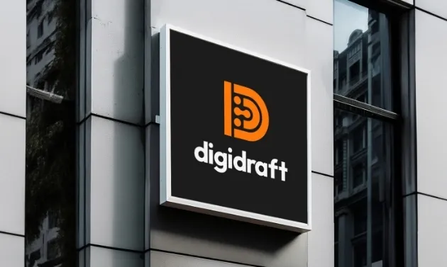
Colour and typography choices in a logo are crucial to a brand’s success. Chosen well, they can increase recognition, communicate values effectively and build positive associations in consumers’ minds. When documented in a logo manual alongside usage rules, they become a system: a visual identity with a palette and typography that stays consistent even when a different designer produces the materials.
Symbolism and metaphor
Symbolism and metaphor in a logo can communicate complex ideas and a brand’s story in a way that is immediately understandable and memorable. Symbolic elements make a logo more than a visual identifier: it tells a story, expresses the company’s mission and highlights its values without words.
Symbolism in a logo can take many forms, from simple icons to complex graphics. The key is to choose a symbol closely connected to the company’s industry, mission or values.
A tree, for example, can symbolise growth, development or ecology, making it a good choice for environmental or consulting businesses. An infinity symbol can appear in a technology company’s logo to emphasise continuous innovation and unlimited possibilities.
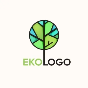
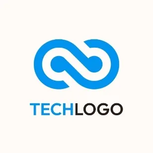
Metaphors in logos work similarly, but are often subtler and require some interpretation. They allow layered, meaningful designs that can build a deeper narrative around a brand.
For example, a mountain in a logo can symbolise the obstacles a company helps people overcome or the heights it aspires to reach. A similar motif could be used by a company making mountain-themed wallpaper.

Symbolic and metaphorical elements in a logo have a particular ability to build an emotional connection with the audience. The associations and emotions these symbols evoke can make people feel closer to the brand, supporting loyalty and trust. A well-designed symbol can become an unforgettable brand element that brings back positive emotions and memories.
Design tools and techniques
Creating a logo combines traditional hand sketching with modern design technology. Each step matters, offering different opportunities for creativity and innovation.
Using a variety of tools and techniques allows designers to explore and develop the visual concepts that best represent the brand.
- Hand sketching - this traditional method makes it quick to experiment with concepts and shapes, giving designers freedom to explore early ideas. Sketches are valuable because changes and adjustments are easy during the initial stages. Hand sketching is also a useful way to capture spontaneous ideas that may arise at any point in the creative process.
- Graphic design software - after defining an initial concept through hand sketches, the next step is to bring those ideas into a digital environment using professional design software. Programs such as Adobe Illustrator and CorelDRAW provide advanced tools and features for precise development and revision. They let you experiment with colour, typography and proportion while maintaining a high level of control over every detail.
- Logo makers - for those looking for more accessible options, online logo makers such as Canva offer a simple, fast way to create professional-looking logotypes. These tools are particularly useful for beginners or small businesses that may not have access to expensive software or professional design services. A logo maker usually offers a library of ready-made elements, shapes and typography that users can customise to create their own unique logo.
- Feedback and iteration - collecting feedback and revising the design are integral to the process. Presenting concepts to clients or a team, then making changes based on their comments, is essential to achieving a satisfying final result. Feedback lets you assess the design from different perspectives and make necessary adjustments before final approval.
Ultimately, the choice of tools and techniques depends on the designer’s preferences, the nature of the project and the resources available. Whatever methods are used, the goal remains the same: a unique, functional and visually appealing logo that communicates the brand identity effectively.
Summary
A logo captures the essence of a brand’s identity, representing it visually while reflecting its philosophy and promises to customers. Creating a logo that attracts attention and remains memorable depends on combining graphic design skills with a deep understanding of what the brand stands for: its mission, values and aspirations.
The process requires creativity and technical precision, but also strategic thought about the best way to communicate a unique brand identity and its values to a broad target audience.
An effectively designed logo therefore becomes a key part of building a strong, recognisable brand that connects with its audience and inspires trust.
FAQ: common questions about logo design
Five questions that return with every logo brief: what makes a good logo, colour, typography, online tools and the design process itself. The sections above discuss them in more detail.
What makes a well-designed logo?
Four qualities: clean lines and simplicity, a clear composition, originality, and legibility across different sizes and contexts. A simple form makes a brand easier to recognise and works on a phone screen as well as a large advertisement. Too many decorative elements distract and obscure the message, so fewer embellishments usually make a stronger mark.
How do you choose colours for a company logo?
Deliberately, not just because you like a palette. Each colour carries associations: blue suggests calm and stability, which is why banks and corporations often choose it; red suggests energy, passion and sometimes danger, making it suitable for brands that emphasise dynamism and strength. The choice should reflect the emotions you want your target audience to feel.
Which font should you choose for a logotype?
One that supports the brand message and remains legible at every size. Serif typefaces tend to feel traditional and solid, while sans-serif typefaces feel modern and approachable. Check whether the typography is distinctive enough to separate the mark from competitors and whether it stays consistent with the colours and the rest of the brand identity.
Can you make a logo with an online tool?
Tools such as Canva offer quick results and a library of ready-made elements, so they can help beginners and businesses without a design budget. The limitation is that you use the same building blocks as everyone else, making originality harder. Vector software such as Adobe Illustrator or CorelDRAW gives you full control over detail, proportion and typography.
What does the logo design process look like, step by step?
It begins with understanding the brand: its goals, values and target audience, alongside market and competitor research to avoid copying existing solutions. Next come hand sketches, because changes cost the least at this stage, followed by developing the chosen direction in vector software. Finally, feedback and iteration: presenting the design, collecting comments and revising it before final approval.
A logo that works comes from decisions, not chance: first the brand and market, then form, colour and typography, and finally revisions. Have a question we have not covered? Email biuro@digidraft.pl. We reply within 24 business hours.